Published on November 2, 2007 By desii3D In WinCustomize Talk
can't figure out why this is happening. I know my taskbar/startbutton et al are kinda on the large side, but this is just for play and to learn skinning.
when I select my skin in the control panel, it looks like its supposed to.
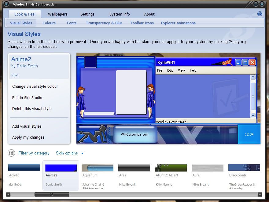

but.. when I apply it:
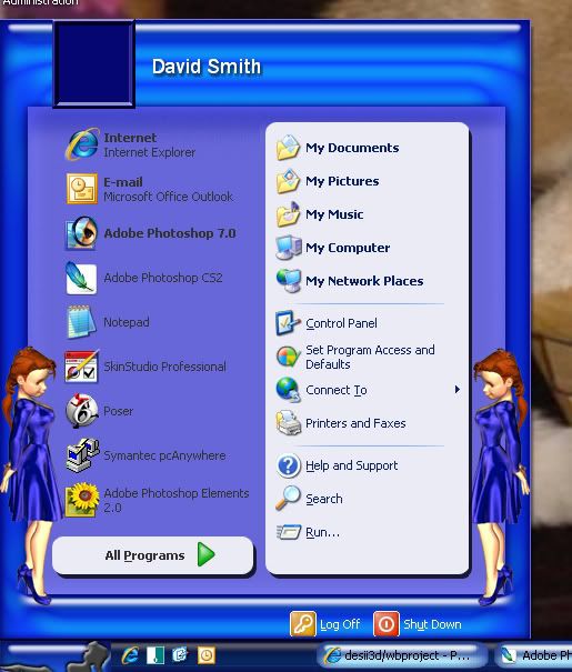
it gets squished verticly and gets WAY darker. anyone willing to take a look at the WBA file and tell me what I'm missing?

Thanks
Dave
Comments
on Nov 02, 2007
send the file to craig at cdoman dot com. I'll take a look tonight. I think I know what the problem is but I will know for sure after I have seen the file.
on Nov 02, 2007
Thanks NightTrain.. it's on the way.
on Nov 02, 2007
taskbar size in the preview is based on start button or taskbar graphic...size once applied is based on content margins for the buttons.
on Nov 02, 2007
I am going to answer here in case someone else needs the info in the future.

1. The taskbar is dark because the image you are using is very transparent. When your looking at it in the preview it has a light background so it makes the taskbar look lighter. If you make your image less transparent you will see that the actual color of the taskbar is alot closer to dark blue than light blue. You have a dark wallpaper and thats why the taskbar is so dark.

2. Your start button image is 65 pixles high. The preview will show the enitre button but when the skin is applied the taskbar height is set based on the content margins of most of the taskbar functions. In other words, the start button image is getting cut off because the taskbar is not stretching in height enough. It works pretty good if you adjust your taskbar to double height.

There are a couple of ways to handle the problem.
- You can make an oversized start button. See my Kali wb skin to see how it is done.
WWW Link
It will take some rewoking of your image though.

- Adjust your sizing margins and content margins to match the start button and keep
it at double height. With the size of the start button as is, you will end up with a double
height taskbar anyways, because the start button is so big. As is, you won't get the taskbar
to match at single height.

- Remake the start button smaller so it cooperates better. Also leave the girlie image without
background so you don't run into stretching problems trying to match the taskbar.

Hope some of this helps. Feel free to ask for help as you go.

* The skin looks to be a fun one.


on Nov 02, 2007
Thanks Craig. I wasn't real happy with the start button anyway so a re-work is no big deal. I want the start button to be half on/half off the task bar with the a transparent background so I will take a look at Kali and see if I can figure it out. Also I think the figure is facing the wrong way so she'll get a flip. I think I can shrink her a little more without loosing the shape detail.

any good reference for what average sizes work well as particular parts? like XX by YY for buttons or XX by YY for titlebars...
I just downloaded the OD documentation so I'll take a gander in there this weekend.

my second try is going better:
on Nov 03, 2007
any good reference for what average sizes work well as particular parts? like XX by YY for buttons or XX by YY for titlebars...


Sticking close to the stock sizes in the Luna template that comes with Skinstudio will keep you out of trouble. As you learn more you will know which images are flexible and which are not. There are too many images and they all act in there own way.

Or pick a favorite skin of yours and disect that in Skinstudio.